Updated October 2026
10 Wedding Font Pairings That Always Work
Wedding Font Lab · Fonts
Quick answer
Short on time? Barbie + The Cottage is the safest luxury pairing, Merlina Darling + Aqeela covers modern premium suites, and the two bundles at the end let you build your own combinations for the price of a single font elsewhere.
The rule behind every pairing below: one expressive font leads, one quiet font supports. Two competing scripts exhaust the eye; two quiet fonts bore it. Contrast in personality — not in volume — is what makes a suite feel designed.
We curate wedding fonts full-time and test every pick on real invitation suites — learn more about us. Some links below are affiliate links, which keeps this site free.
A wedding suite is a small typographic ecosystem: names, dates, headings, body text, signage — all talking to each other. Pair the fonts well and guests never notice the machinery; pair them badly and even expensive paper feels off. The good news is that working pairs follow a pattern you can reuse again and again.
Each pairing below names its leader (the font that carries names and headlines) and its support (the quieter partner for details and body text), then explains where the combination belongs — ballroom, garden, beach or black-tie. Every font comes from Creative Fabrica, with commercial use covered by the All-Access license.
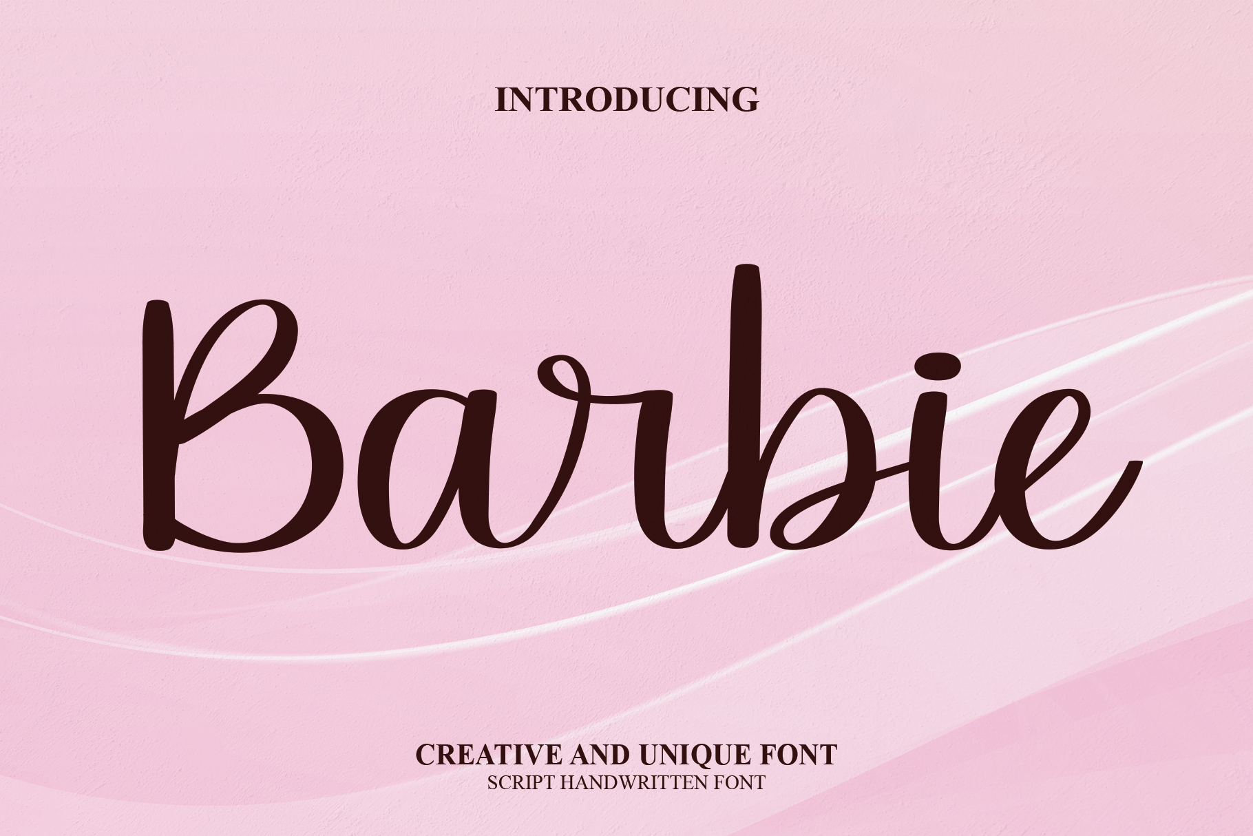
The safest luxury pair on this list. Barbie leads with fairy-tale curves on names and headings; The Cottage answers with clean, refined letterforms for body text and venue details. Ballrooms, candlelight and gold-foil accents — this pairing was practically designed for them.
View on Creative Fabrica →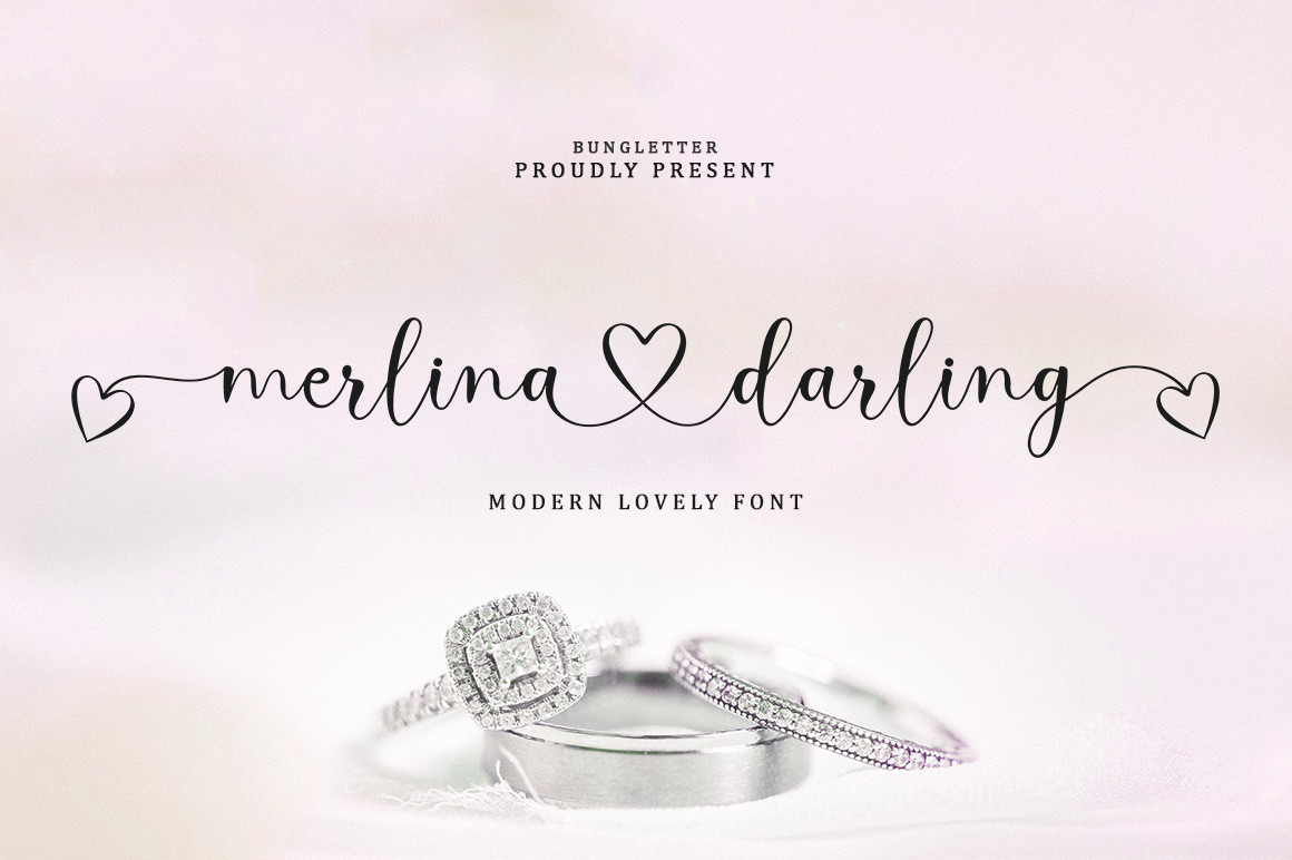
Modern premium. Merlina's linked strokes give headlines a seamless, branded flow, while Aqeela stays quietly legible at small sizes — exactly what menus, RSVP cards and website headers need. The combination holds together across print and digital suites.
View on Creative Fabrica →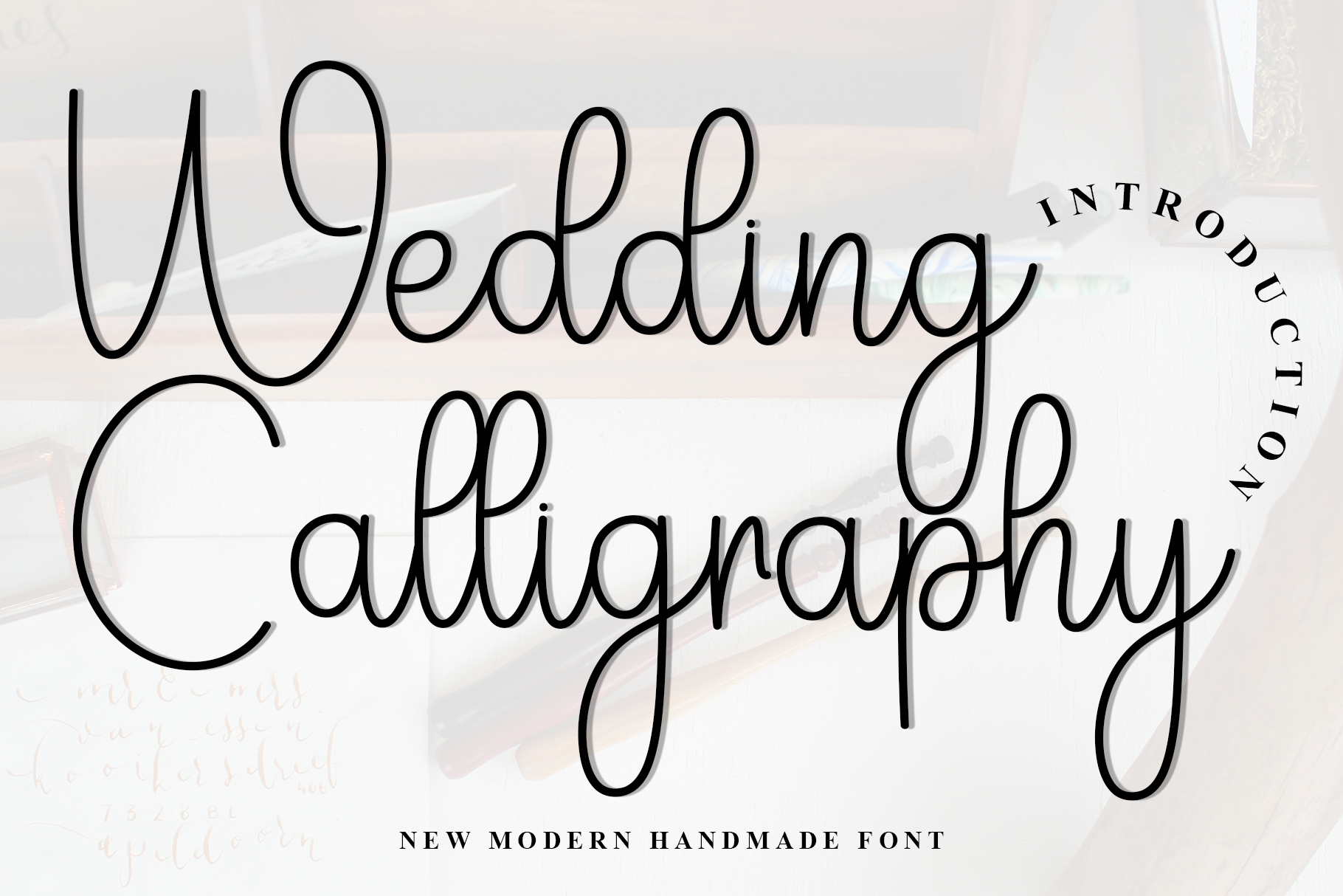
Formal meets fresh. Wedding Calligraphy handles the ceremonial pieces — invitation, program cover — with engraved-style discipline; Wedding Memories takes the contemporary pieces like signage and social announcements. Traditional families, modern couples: this pair speaks both languages.
View on Creative Fabrica →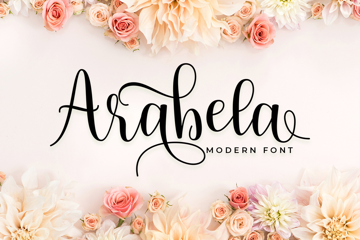
Sophistication with a wink. Arabela's jewelry-like swashes lead the invitation, and Sweet Wedding softens supporting cards with friendly, affectionate curves. Works beautifully for engagements, bridal showers and any stationery that should feel celebratory rather than stern.
View on Creative Fabrica →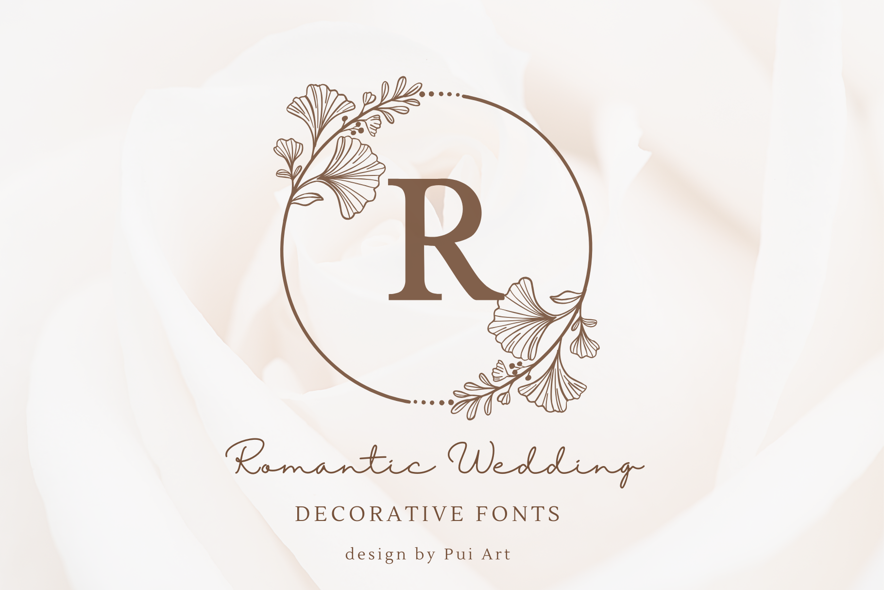
The love-letter suite. Both scripts are emotional, but they differ in scale: Romantic Wedding pours drama into headings, Dear Wedding whispers through place cards and personal notes. Keep the leader large and the support small, and the tenderness never turns to mush.
View on Creative Fabrica →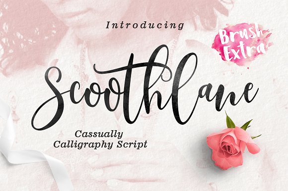
Relaxed and warm. Scoothlane's gentle swashes dress up garden-party headings while Best Week's easygoing bounce keeps menus and farewell notes approachable. Ideal for outdoor celebrations, brunch-style receptions and couples allergic to stuffiness.
View on Creative Fabrica →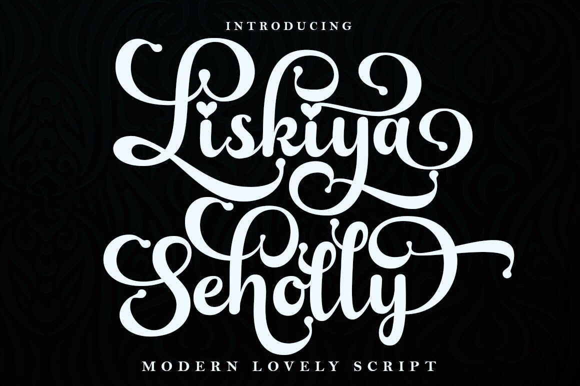
Boho destination energy. Liskiya's flowing casual calligraphy leads, Mandalica's brush texture adds handcrafted warmth to tags and packaging. Beach ceremonies, desert elopements, wooden signage — this pairing thrives wherever formality goes to die happily.
View on Creative Fabrica →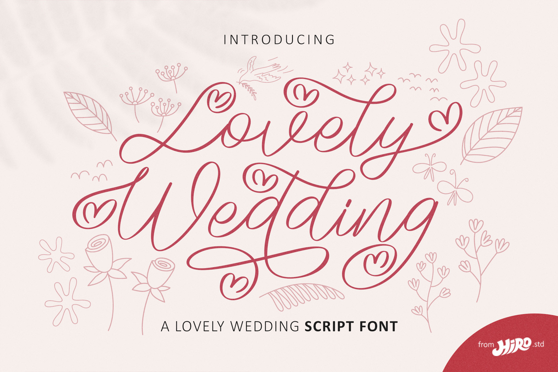
Tender storytelling. Lovely Wedding frames the formal invitation with classic grace, Wedding Story carries table numbers, photo overlays and thank-you notes with personal charm. A pairing for couples who want the whole suite to read like one continuous letter.
View on Creative Fabrica →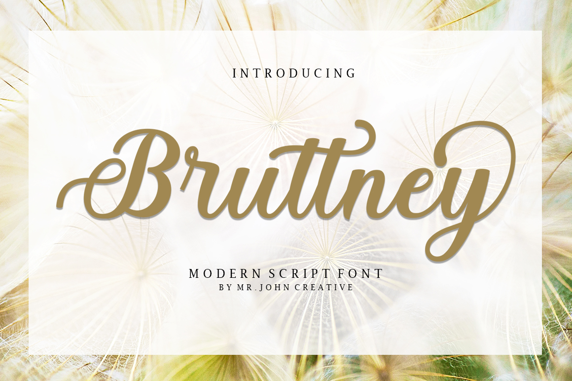
Classic celebration. Bruttney's romantic rhythm leads the invitations, Wedding Bells adds ringing, festive character to programs and reception signage. Traditional church weddings and grand-hall receptions — anywhere joy should look polished.
View on Creative Fabrica →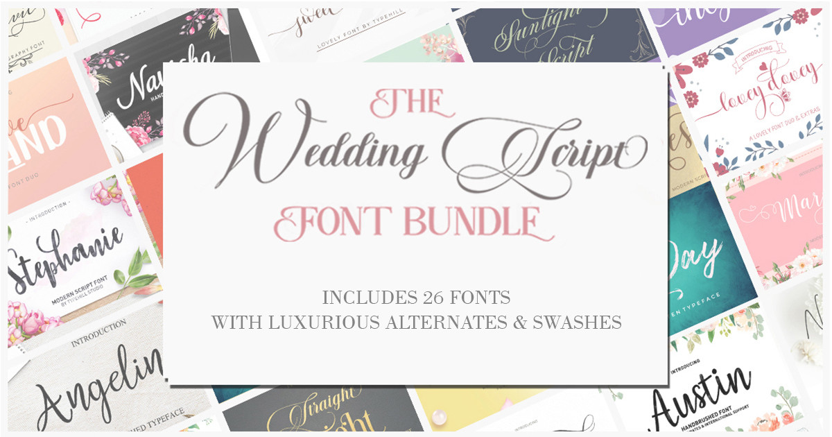
Eighty-seven fonts in two downloads — the build-your-own pairing kit. Test leader-and-support combinations across 57 script styles and 30 wedding-and-craft faces until one clicks. The most economical route to a pairing nobody else is using.
View on Creative Fabrica →Wedding Fonts — FAQ
How many fonts should a wedding suite use?
Two is the professional default: one expressive script for names and headings, one quieter face for details. Three is acceptable if the third is reserved for a single element like the date. Beyond that, cohesion collapses and the suite starts to look like a font catalog rather than a designed set.
Can I pair two scripts together?
You can — pairings five and six on this list do exactly that — but the scripts must differ clearly in weight, scale or energy. Two scripts of similar weight and rhythm compete, and the eye gives up. If you love two swashy fonts, separate them across different pieces: one on the invitation, one on the signage.
What pairs well with a very ornate script?
Something almost boring — and deliberately so. Ornate scripts spend the viewer's attention, so the supporting font should be a clean, quiet style with even rhythm: The Cottage, Aqeela or Wedding Memories all do this well. The plainer the partner, the more expensive the flourish looks.
Do font pairings matter for save-the-dates and signage too?
Yes — the pairing is your suite's identity, so it should repeat across every piece: save-the-dates, menus, welcome signs, favors. Repetition is what makes stationery feel coordinated. Vary sizes and layouts freely, but keep the same two fonts doing the same two jobs.
Can I use these pairings in Canva?
Absolutely. Download both font files from Creative Fabrica, then upload them in Canva under Brand Kit → Upload a font (Canva Pro). Once uploaded, save the pair as a Brand Kit combo so every new design starts with the right fonts already in place.